Karin Novozamsky
6. March

Karin Novozamsky
6. March
The Ottmanngut is a house in Meran which is over 700 years old and since 1850 it is managed by the Kirchlechner family as a guesthouse. Since 2012 under the direction of Martin Kirchlechner as "Suite & Breakfast" with 9 individual rooms and a breakfast served in 3 courses. Martin studied landscape planning and wild animal ecology in Vienna when he jumped into the cold water to become a hotelier. But this is another story. We are happy to report on our collaboration with him, his family and his team.
The briefing by Martin Kirchlechner was as clear as it was concise: "We need an appearance for our house, which is just as appropriate to the tradition of the house and the sensitive handling as to the demand for discourse and actuality."
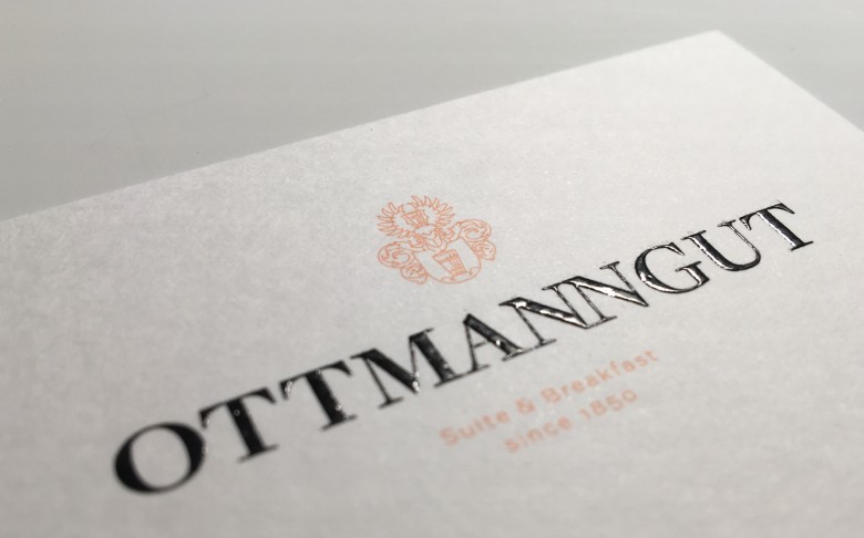
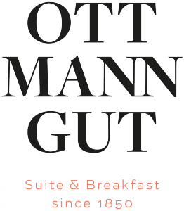
The basis of the logo was the existing lettering. We have replaced it with a more balanced font, and either it is combined with the family crest, or it is split in three lines. The addition to the logo "Suite & Breakfast since 1850" describes the offer of the Ottmanngut and points to the long-standing tradition. The logo system adapts to the circumstances, allows for flexibility and corresponds to the responsive approach that is known from the digital design field.
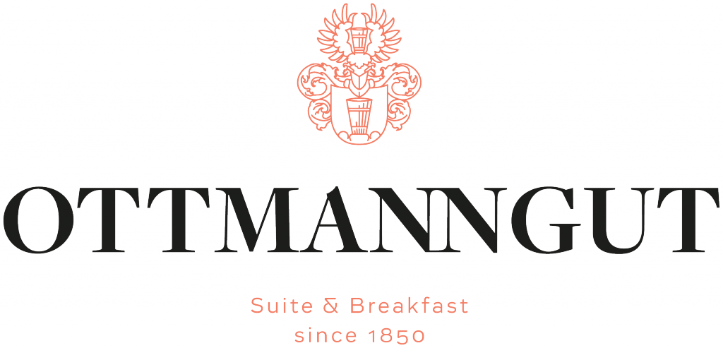
The chosen special color has resulted from the porphyry occurring in the masonry of the house. It forms a gentle yet strong contrast to the black of the logo and reflects the warmth of the house, which everyone knows, who already had the pleasure to be a guest here.
The writings form the suspense between tradition and modernity, just as the house itself does. The used Antiqua is the "Freight", the Sans Serif comes from the Viennese typo-designers DOTS & STRIPES TYPE and is called Vito.
A further important design element of the appearance is the generous handling of white space. These are rooms, which are also found in the Ottmanngut. Free spaces in which discussions with the hosts, or with other guests, can arise or where one can also simply withdraw with a good book.
In order to provide the viewer with important information quickly and to offer a visual orientation, special icons have been developed. We particularly liked the bed with the croissant moon over it.
High-quality paper and noble, unobtrusive printing processes characterize all printed material. In the digital area, it was our concern to provide an intuitive layout within the appearance, to ensure fast access to information and the possibility to book the rooms at any time.
This image is the result of a clear briefing, many conversations and great trust. We say thank you.
Karin Novozamsky
Novozamsky
Design & Brand Strategy